Through out the last couple of years we have seem quite a few suggestions to a new and more modern look and feel for LibreOffice. Some of these initiatives has already found its way into the product, and you can e.g., see a much more light weight ruler in Writer and the whole sphere around using and handling templates has been reworked with a new design. Each of these examples are small steps ahead towards a more modern layout. But when will we see something more like a jump into the future?
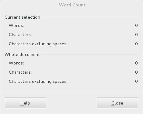
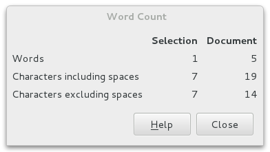
We already got it although you might not actually notice it. More than two hundred dialogues has been recomposed with a completely new development method. This work has a big strategic importance for the community, because in addition to improving the appearance of the UI right now, it opens a lot of long term opportunities.
An example is the word count dialogue. This is how the old method looked:
And with the new WidgetLayout method:
You can read more about this new Widget Layout here:
https://wiki.documentfoundation.org/Development/WidgetLayout .
But soon you will see some eye candy too.
Experiments are going on to take advantage of the fact that more and more screens are 16:9 format and not as earlier in 4:3 format. This development is resulting in wider screens both on laptops but also when using traditional desktop computers. This challenges the planning of the application wire frame. The trend goes towards vertical panels or tool bars that takes advantage of the wider screens. This is in contradiction to the Microsoft approach that implements his ribbons under the ceiling taking up space where there is no space.
 |
| Illustrating the proportions |
I will emphasize that this is a suggestion and not yet a decision and the final implementation will probably take some time.
An example of how the context sensible tools can appear to the right.
 |
| Sidebar in Writer |
Please notice that these screen shots are not only mock-ups but actual screen shots from a running version on Windows. Please note that this is a very early and absolutely not stable version.
More screen shot below in this article.
The idea is a panel in the right (or left) side of the screen with a bunch of tools. Some tools are static e.g., the Navigator and the Gallery and some others are context sensitive and changes its content from what your cursor is selecting. This is the case with the the properties tool.
You can select between the various tools with the small icons most right. The plan is that these tools will replace some of the traditional toolbars in the top of the screen. Then we take really advantage of the wide screen.
Last but not least it seems that its possible to develop and install extensions that enhance the functionality also in the panel. I have installed two extensions that uses the task pane in earlier versions of LibreOffice and they automatically show up in the icon bar but the extensions doesn't show up in the pane yet. But it really looks good.
The background for this experiment is actually a result of IBM donating Lotus Symphony to Apache Open Office. The donation is licensed in such way that the functionalities can be ported to LibreOffice.
As mentioned earlier this feature is absolutely in a very early stage and it needs a lot of fine tuning to be ready for production. First of all the original code was developed back in 2008 and has not been maintained since. Also it takes quite a lot of effort to make it fit into the LibreOffice code base in a proper and safe way.
More screen shots:
 |
| Navigator in the Sidebar |
 |
| Sidebar in Calc |
 |
| Gallery in Calc |


 Del.icio.us