Through out the last couple of years we have seem quite a few suggestions to a new and more modern look and feel for LibreOffice. Some of these initiatives has already found its way into the product, and you can e.g., see a much more light weight ruler in Writer and the whole sphere around using and handling templates has been reworked with a new design. Each of these examples are small steps ahead towards a more modern layout. But when will we see something more like a jump into the future?
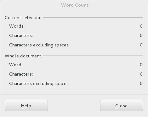
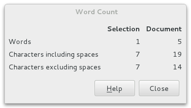
We already got it although you might not actually notice it. More than two hundred dialogues has been recomposed with a completely new development method. This work has a big strategic importance for the community, because in addition to improving the appearance of the UI right now, it opens a lot of long term opportunities.
An example is the word count dialogue. This is how the old method looked:
And with the new WidgetLayout method:
You can read more about this new Widget Layout here: https://wiki.documentfoundation.org/Development/WidgetLayout .
But soon you will see some eye candy too.
Experiments are going on to take advantage of the fact that more and more screens are 16:9 format and not as earlier in 4:3 format. This development is resulting in wider screens both on laptops but also when using traditional desktop computers. This challenges the planning of the application wire frame. The trend goes towards vertical panels or tool bars that takes advantage of the wider screens. This is in contradiction to the Microsoft approach that implements his ribbons under the ceiling taking up space where there is no space.
 |
| Illustrating the proportions |
I will emphasize that this is a suggestion and not yet a decision and the final implementation will probably take some time.
An example of how the context sensible tools can appear to the right.
 |
| Sidebar in Writer |
More screen shot below in this article.
The idea is a panel in the right (or left) side of the screen with a bunch of tools. Some tools are static e.g., the Navigator and the Gallery and some others are context sensitive and changes its content from what your cursor is selecting. This is the case with the the properties tool.
You can select between the various tools with the small icons most right. The plan is that these tools will replace some of the traditional toolbars in the top of the screen. Then we take really advantage of the wide screen.
Last but not least it seems that its possible to develop and install extensions that enhance the functionality also in the panel. I have installed two extensions that uses the task pane in earlier versions of LibreOffice and they automatically show up in the icon bar but the extensions doesn't show up in the pane yet. But it really looks good.
The background for this experiment is actually a result of IBM donating Lotus Symphony to Apache Open Office. The donation is licensed in such way that the functionalities can be ported to LibreOffice.
As mentioned earlier this feature is absolutely in a very early stage and it needs a lot of fine tuning to be ready for production. First of all the original code was developed back in 2008 and has not been maintained since. Also it takes quite a lot of effort to make it fit into the LibreOffice code base in a proper and safe way.
More screen shots:
 |
| Navigator in the Sidebar |
 |
| Sidebar in Calc |
 |
| Gallery in Calc |


 Del.icio.us
13 comments:
Yes! Sidebars! Some use for all the width!
Keep up the good work!
Thank you for this blog entry. Besides LibreOffice, I have also worked with Lotus Symphony and I think the sidebar is a very good approach. Contrary to Microsoft's ribbon, it is appealing to both, power users and beginners.
You briefly mention the Apache OpenOffice guys in the blog, but since they developed these nice feature, I think they deserve a bigger thank you. I also honestly hope that bug fixes done by the LibreOffice team on the sidebar feature feeds back into the Apache source. I know, license issues and so, but I think it would be very fair.
Its good to have this substitute, I don't need it mostly since I use to rotate my monitor to portrait mode.
There seems to be changes in 4.1 beta for this?
This is an excellent concept, pity your screenshots showed toolbar at the top still.
It seems so much cleanup has been done in Libreoffice that people are now looking for a larger change
I agree with comments about Apache, without understanding what seems to be a poisonous past.
After reading this post I am not sure I really understand it, especially it's connection with title.
Did you really mean "exiting" (as in quit; that is: "guys, we have this new featureset in UI, I will no longer do anything UX-wise in LO"), or did you mean "exciting" (as in thrilling; that is: "guys, check out this new great feature that we can try in LO 4.1")?
Thanks in advance for clarification.
@Mirosław Zalewski: Thats embarrassing. The title should be exciting and its corrected now.
I'm really sorry.
Cheers and thanks for putting my attention to the typo.
@Leif Lodahl: that's fine, I guess. It could happen to anyone.
Thanks for making it clear and sorry for sending my comment twice. Feel free to delete unnecessary one.
Cheers
@Anonymous: Good point about Apache Open Office. But I would like to redirect the credit to IBM as they developed the side bare for their proprietary derivate of OpenOffice.org, Lotus Symphony and later contributed the code to Apache.
I'm not a lawyer or in any way an expert on licenses but here is my two cents to the discussion:
There is actually nothing that prohibits Apache to implement any code from LibreOffice into their binaries. What is prohibited is to re-license the source code. The Document Foundation can't in any way give permission to that, as each individual contributor owns his own code. TDF doesn't ask contributtors to hand over copyright or any other rights to the foundation.
I can very well understand that they don't. If they did they would end up with binaries from source code with various licenses. This would be a mess and in the future impossible to control.
The Document Foundation has decided to use copyleft licenses for the source code. These licenses requires that the original license is respected at all times (can't be re-licensed). Apache license is not a strong copyleft license and it is allowed to re-license the source code. Each of the two organizations has made their decisions from each their reasons i believe.
Btw. nothing prevents contributors to submit their code to both LibreOffice and Apache.
It already looks really wonderful!! Please keep up the good work you guys!!
I'd like to point out that it is Apache OpenOffice, not Apache Open Office.
And as to redirecting all the credit for the sidebar to IBM for the property panel in Symphony, I think you should read this blog post:
The Sidebar: New And Improved
Specifically the part that says:
"The core implementation of the sidebar and the framework provided for panel developers is completely new. The sidebar looks similar to the Symphony property panel but shares no code with it."
Credit where credit is due!
I personally find it pretty lame that you take Apache's code but don't publish it yourself under Apache License. All modifications you do is under MPL. It's legal but it's lame and I'm 100% certain you chose a license that's against Apache's policies on purpose.
@KAMiKAZOW:
Since the Choice of MPL as License pre-date the creation by IBM of the Apache OpenOffice fork by almost a year, so clearly it was not related what-so-ever with "Apache's policies"
Post a Comment